Mapping early years practice
A new method of clustering local authorities to help identify variations in practice that drive early years outcomes


Introduction
Nesta’s fairer start mission is for every child to have a fair start in life.
Our mission is to narrow the outcome gap between children growing up in disadvantage and the national average.

To achieve this goal, we want to learn from practices in English local authorities (LAs) that are already driving good early years outcomes for children eligible for free school meals. In this project, we are trying to find out what LAs where children on free school meals reach a Good Level of Development in their early years foundation stage profile (EYSFP) are doing differently from others.
The fundamental question is: why do local authorities with similar demographics and circumstances have different results in the Early Years Foundation Stage Profile (EYFSP)?
Exploring the maps of England below, we can see that trends in early years outcomes seem not to be related to geographical location, or whether a local authority is a major city or a predominantly rural area.
If you hover over the LAs, you can see the actual percentage of children on free school meals (FSM) who reach a Good Level of Development (GLD). We have used data from 2019 as this is the latest year in which national data was available. The maps show that neighbouring LAs can have very different outcomes and that these differences persist within London (Figure 2).
Figure 1: Map of England (excluding London) showing the percentage of children on free school meals reaching a Good Level of Development. Hover over the individual LAs for name, number of children in that LA on FSM and the more precise value for percentage of children reaching a Good Level of Development. EYFSP data for 2019 from the Department for Education education statistics catalogue.
In areas of London such as Hackney (69% of children on FSM reaching a GLD) and Newham (71%), the most disadvantaged children have relatively good outcomes. What might these LAs be doing to help drive these results? The percentage of children reaching a Good Level of Development who are not on free school meals in Hackney is 70% – which means that in 2019 this local authority had almost closed the disadvantage gap (Data from the EYFSP, Department for Education).
Figure 2: Map of London showing the percentage of children on free school meals reaching a Good Level of Development. Hover over the individual LAs for name, number of children in that LA on FSM and the more precise value for percentage of children reaching a Good Level of Development. EYFSP data for 2019 from the Department for Education education statistics catalogue.

We know that every LA is facing challenges linked to demographic factors such as the number of people living in poverty. We want to help disentangle demographics from variations in service delivery that might be affecting outcomes. While we expect children's outcomes to be intrinsically linked to the amount of deprivation, the graphs below (Figure 3) show that some LAs are deviating from the trend. The pink dots highlight the London boroughs, with the left plot showing the average percentage of all children reaching a Good Level of Development (GLD) and the right plot showing the average percentage of children on free school meals (FSM) reaching a GLD. We also see that for disadvantaged children, the trend that links outcomes to deprivation is reversed – those who tend to live in areas of lower deprivation have poorer outcomes. However, there is a lot of variation in this and the trend is not quite as defined as for all children (left plot).
Figure 3: Pink dots are London boroughs, blue dots are all other LAs in England. Yellow line is the England average for the percentage of children reaching a Good Level of Development. (Left) The mean percentage of all children reaching a Good Level of Development in the Early Years Foundation Stage Profile plotted against the mean Index of Multiple Deprivation (IMD) decile for the LA. (Right) The mean percentage of children on free school meals (FSM) reaching a Good Level of Development in the EYFSP plotted against the mean IMD decile for the LA. EYFSP data for 2019 from the Department for Education education statistics catalogue and IMD data for 2019 from the Ministry of Housing, Communities & Local Government English indices of multiple deprivation.
It's hard to know whether disparities are caused by something that one LA is doing differently to others, or whether they are due to factors that lie outside the delivery of public services. In this study, we're hoping that by combining a quantitative method of grouping LAs based on shared characteristics with an in-depth survey of LAs’ policies and practices, we can explore nuances in the differences in outcomes for disadvantaged children.


Methodology
In order to meaningfully compare early years foundation stage profile (EYFSP) results, it's vital that we differentiate between the circumstances of the LAs. We need to look at LAs that face similar challenges. For example, we would expect that an inner city urban area is going to be in a different situation to a rural county. Therefore, we use a range of data sources to enable us to create groups of similar local authorities.
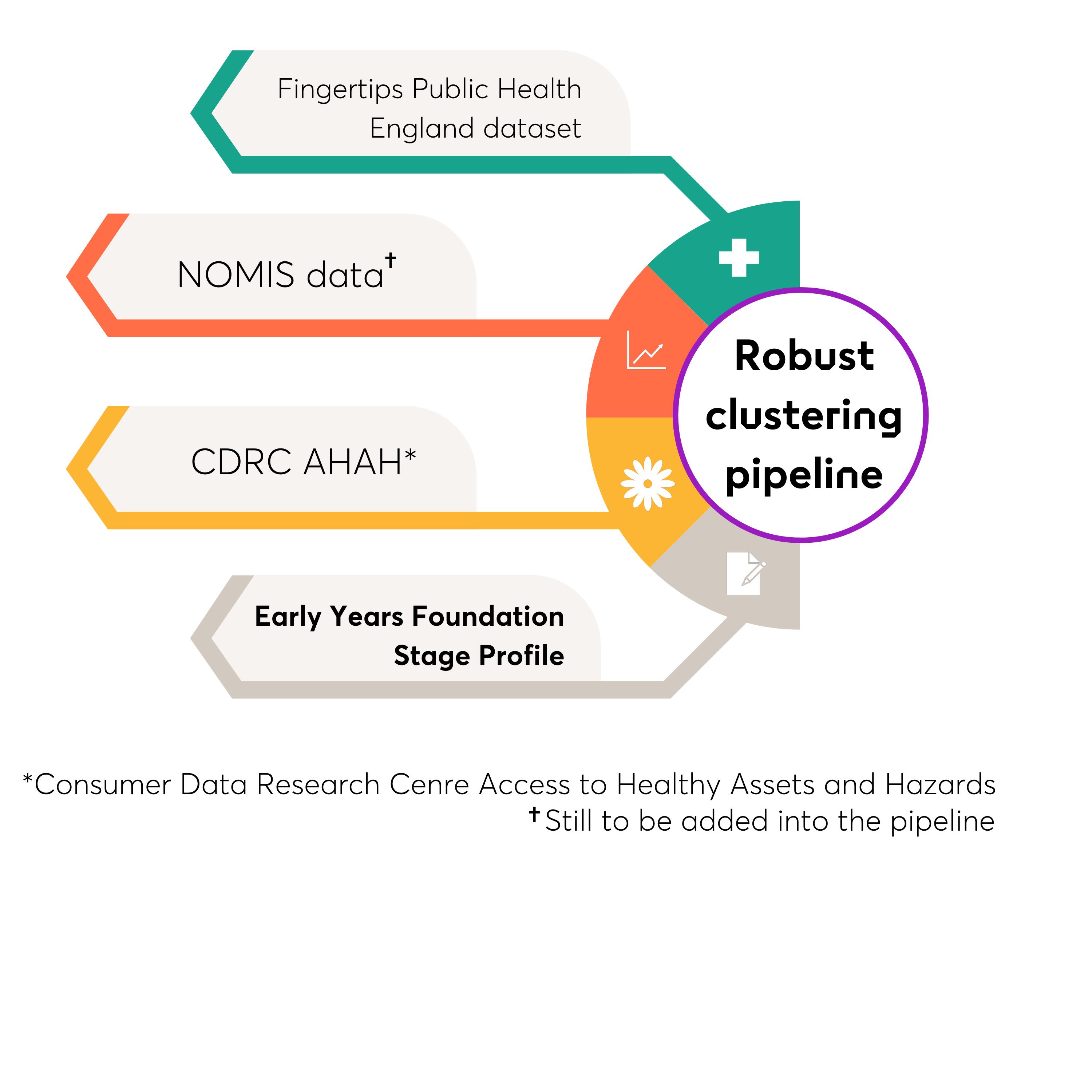
There are many ways of grouping LAs together, for example the local authority interactive tool (LAIT) and the children’s services statistical neighbour benchmarking tool allows LAs to find their closest neighbour based on a number of characteristics (see Appendix A of the LAIT user guide). We wanted to use publicly available data to create our own grouping and to use a wider variety of data. LAIT includes data on child protection, children’s health, pupil attainment and judgments from Ofsted, but we wanted to take into account the environment in which a child grows up and include more data on parental circumstances. We've clustered the LAs using a wide range of variables from the Fingertips Public Health England dataset and the Consumer Data Research Centre (CDRC) Access to Healthy Assets and Hazards (AHAH) data.
These datasets contain a wide range of variables, including mental ill health, substance misuse and domestic abuse. Known as the “trio of vulnerabilities” these are key risk factors considered in safeguarding, which may have an effect on a child's opportunity to develop at the same rate as their peers. The data also includes demographic data, deprivation levels and local residents’ access to services, all of which are crucial when trying to cluster LAs and link them to their most similar counterparts.
Using this data and our outcome measure of EYFSP, we input both of these datasets into our robust clustering pipeline, developed by Nesta's Data Analytics Practice, which runs through a series of steps to produce clusters of LAs. The process is as follows.
- First we reduce the number of variables from the data we use. Too many variables can cause issues later on in the process. We remove variables which are strongly related to each other – for example the Fingertips dataset has a number of different ways of measuring the prevalence of smoking, so we keep only one of these.
- We then repeatedly run three different clustering algorithms using different parameters each time and record the cluster the LAs fall into with each run-through.
- Some of the LAs will be grouped with the same LAs repeatedly, some will not be grouped together at all and some will be in the same cluster just a few times. The ones that most often end up in the same cluster together make up the final clusters.
- Finally, using the EYFSP percentage of children on free school meals reaching a Good Level of Development as our outcome measure, we investigate which clusters have the most variability in the percentage of children on free school meals who reach a Good Level of Development.
Despite the robustness of the clustering, we are aware of some limitations to the method. These limitations stem predominantly from the data we are using. The EYFSP is currently only available for 2019 and is only available at county and unitary authority level. This means we are comparing entire counties such as Lancashire, Cumbria and Buckinghamshire to a single London borough. As we have built this pipeline to be open source, we are not currently able to improve the granularity of the data. However, we may be able to improve on this in the future. A similar issue lies with the Fingertips data – although it is available at ward level and not just county and unitary authority level, not all the datasets are current (ie, from the last couple of years) nor are they completely available for all areas. This lack of consistent coverage has meant that a couple of LAs had to be removed from the clustering due to the missing data (Rutland, Isles of Scilly and Hammersmith and Fulham).
At the end of the clustering pipeline, we will have a series of clusters each containing LAs that share similar characteristics. We are then able to compare variations in EYFSP results both between and within clusters of local authorities.


Results
The map of the clusters (Figure 4) shows the LAs that have been grouped together using our clustering method. The LAs that are missing did not have sufficient data in the Fingertips dataset to be included in our method.
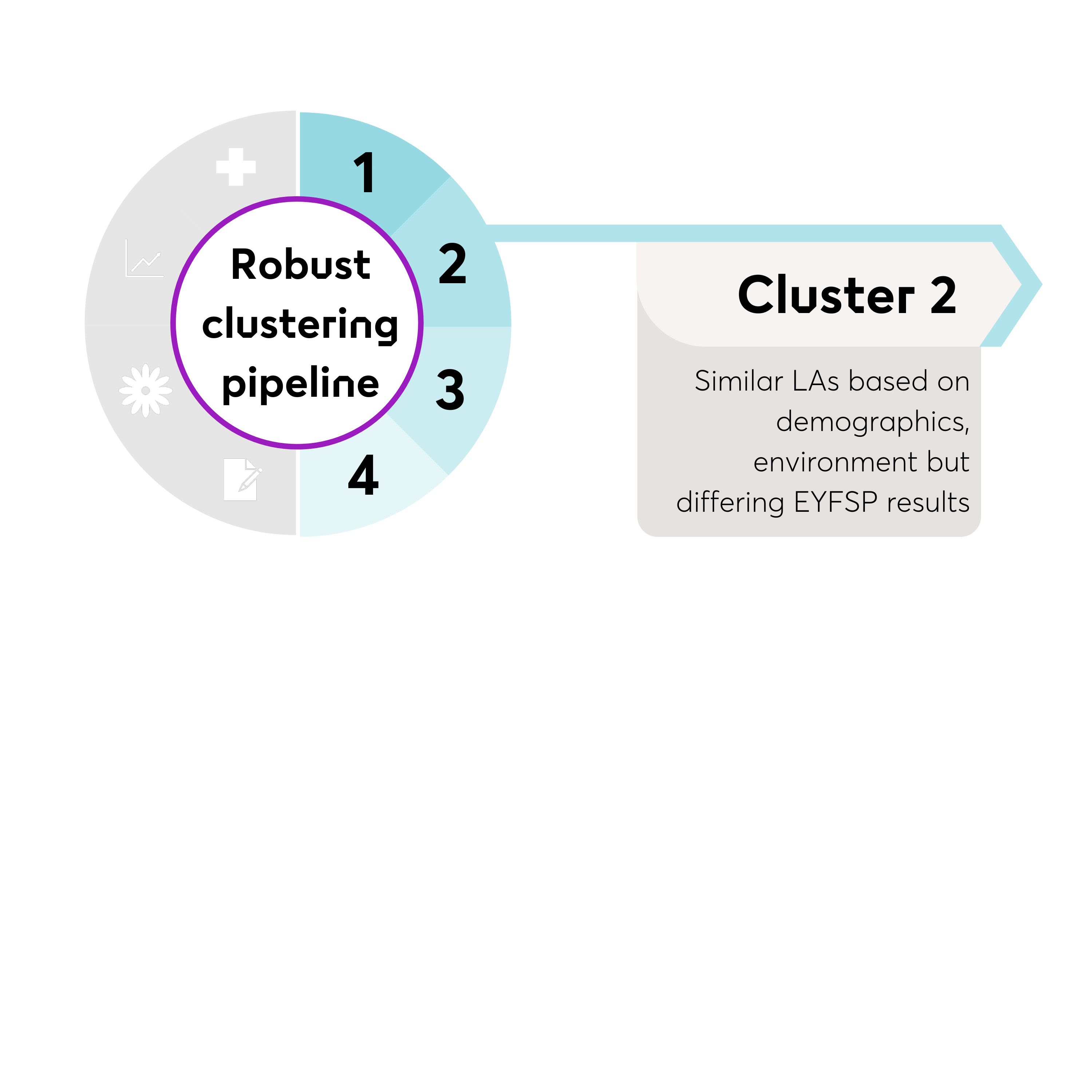
We can see seven clusters have been generated (numbered 0-6) which can be described as follows:
- Cluster 0 LAs with high deprivation and lower than average life expectancies.
- Cluster 1 Bigger cities outside of London, characterised by a cardiovascular disease prevalence and more children in low-income families than average.
- Cluster 2 LAs with low deprivation and a higher than average life expectancy.
- Cluster 3 London boroughs (excepting Richmond-upon-Thames, Bromley and Greenwich), with significantly higher than average pollution.
- Cluster 4 More rural LAs with an ageing population.
- Cluster 5 Metropolitan areas in the North of England with higher than average hospital admissions and a higher crime rate.
- Cluster 6 LAs containing a high proportion of commuter towns with a higher than average working age population.
Within the clusters, the LAs have similar circumstances and thus are more likely to have challenges in common with each other than with LAs outside of their cluster. A more deprived London borough with access to a highly connected public transport system will configure its services differently compared with a less deprived small town that requires use of a car to access services.
With this in mind, we can look at the differences in EYFSP results for children on free school meals in each cluster (Figure 5). The box plot shows the variation in results for each cluster. Cluster 3 which contains the London boroughs has small variation whereas Cluster 2, a cluster made up of the less deprived LAs has a lot of variation in the EYFSP results. Cluster 3 (London LAs) also has better results on average – box plots to the right of the national average represent better than average results, box plots to the left are below average.
Another way to show this variation is to plot the individual LAs and how they compare to the cluster average (Figure 6) – each coloured dot on this graph represents one local authority. This graph is not comparable for individual LAs between clusters, only within clusters. Colours towards the red end of the spectrum are LAs that have better outcomes and have higher percentages of children on free school meals reaching a Good Level of Development when compared to others in their cluster. Colours towards the blue end of the spectrum are LAs where children have poorer outcomes when we consider the percentage of children on FSMs reaching a GLD.
With this in mind, what can we learn from those LAs that are coloured red? What policies and practices do they have in common with other LAs in their cluster and what are they doing differently from each other? More importantly, can we extend or adapt the approaches they are using to LAs where children are not reaching a GLD? Can they give us clues about new practices that might help us work together to close the early years disadvantage gap? Most importantly, what learning can we share so that children who come from disadvantaged backgrounds have a fair start in life?
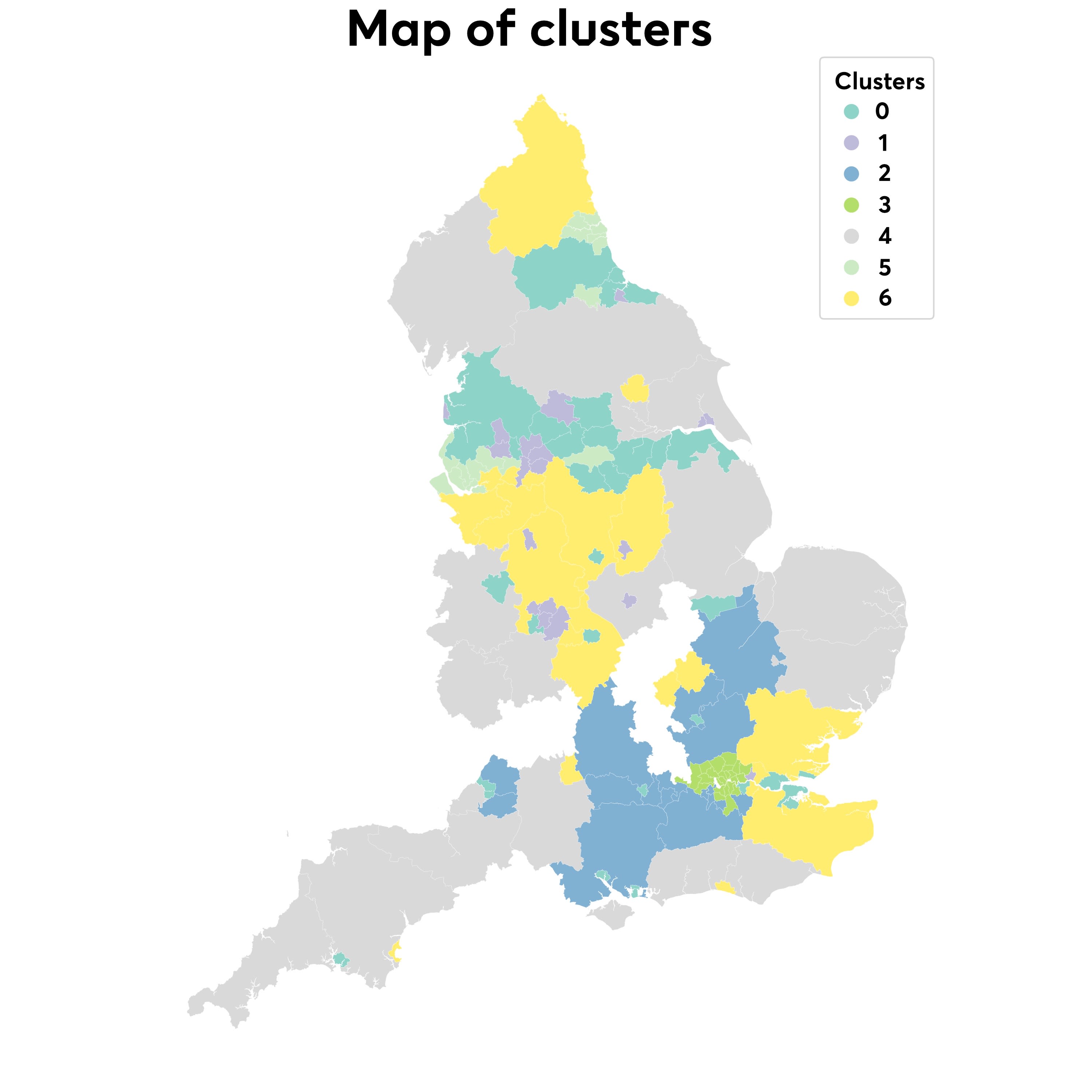
Figure 4: Map of the clusters produced by the robust clustering pipeline.
Figure 4: Map of the clusters produced by the robust clustering pipeline.

Figure 4: Map of the clusters produced by the robust clustering pipeline.
Figure 4: Map of the clusters produced by the robust clustering pipeline.


Figure 5: Box plot showing the variation for each cluster for the percentage of children on free school meals reaching a Good Level of Development.
Figure 5: Box plot showing the variation for each cluster for the percentage of children on free school meals reaching a Good Level of Development.
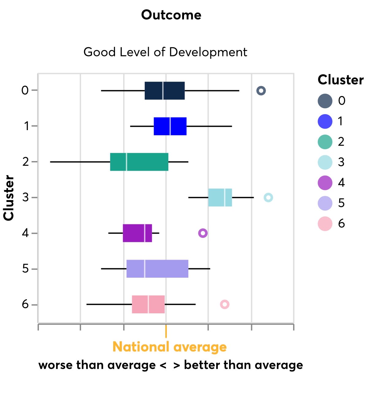
Figure 5: Box plot showing the variation for each cluster for the percentage of children on free school meals reaching a Good Level of Development.
Figure 5: Box plot showing the variation for each cluster for the percentage of children on free school meals reaching a Good Level of Development.

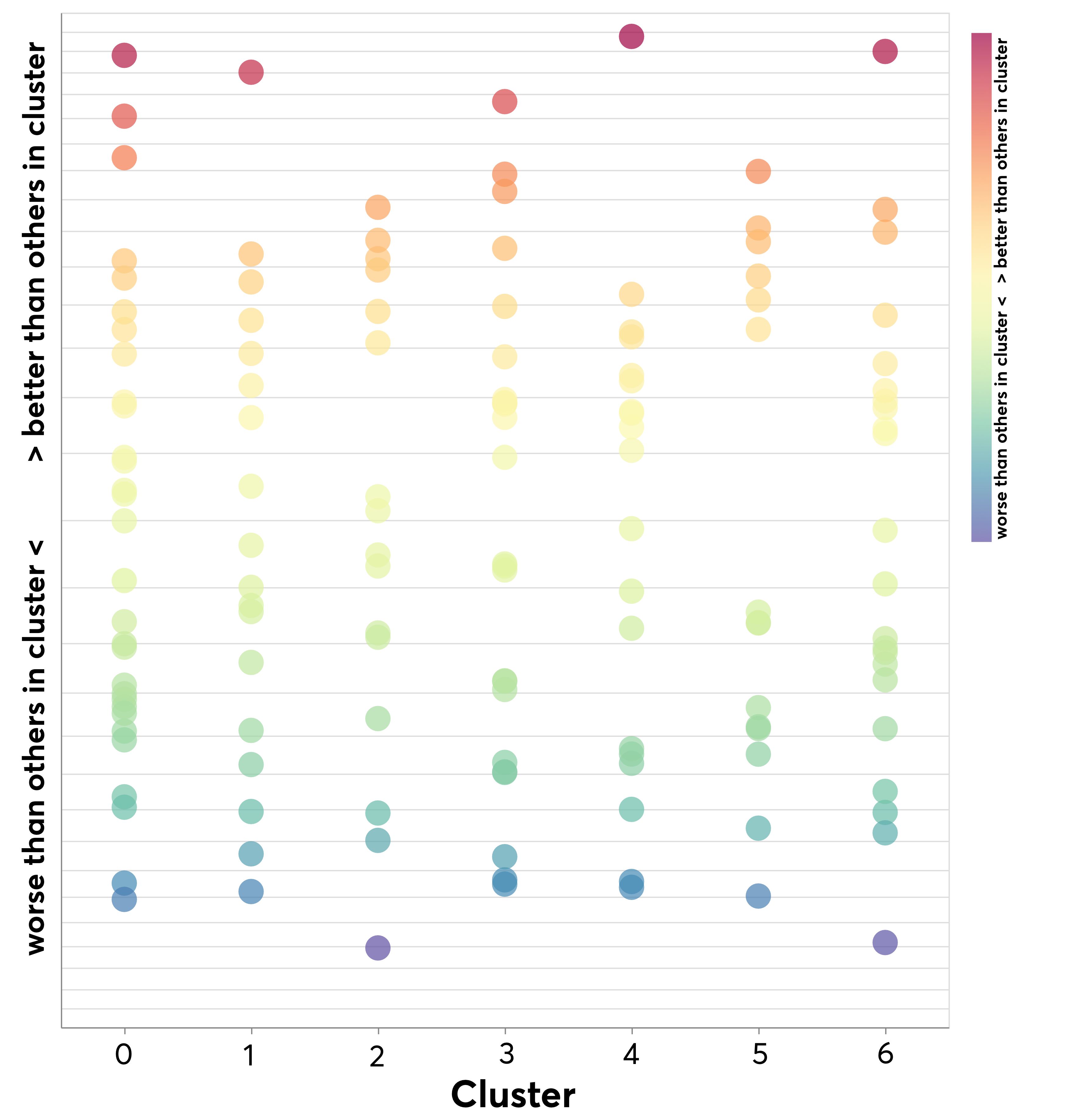
Figure 6: Graph showing the individual LAs (each dot) in each cluster, and whether they're doing better than others in the cluster or worse when we look at the percentage of their children of free school meals reaching a Good Level of Development. Scale is non linear.
Figure 6: Graph showing the individual LAs (each dot) in each cluster, and whether they're doing better than others in the cluster or worse when we look at the percentage of their children of free school meals reaching a Good Level of Development. Scale is non linear.
Next steps: survey
We aim to combine the quantitative aspect of this work with a series of surveys and interviews to explore exactly what policies and practices each LA in England has in place to support children and families.
We will conduct a detailed survey of factors, ranging from the interventions and assessments that LAs use to the ways in which they engage families and use data. The long-term goal is to administer an England-wide survey of all LAs; we think this will be the largest study of early years practice ever conducted. Currently, we are running a pilot survey with 30 local authorities to help ensure we create the most informative survey we can but in a way which is not too burdensome for the staff working in LAs.
In the meantime, the clustering work will not remain static but will be updated with the latest EYFSP data once it has been released. We will also look for new datasets that we can also include in our analyses, for example the new Census 2021 data. The code for the robust clustering pipeline can be found on the Nesta Github.
The aim of this project is to create actionable insights. We want to identify best practice from the LAs already bucking the trend in early years outcomes and support LAs with similar circumstances to implement promising suitable practices in their own early years services and programmes.
We want to work towards a future in which every child can have the same opportunities, no matter what circumstances they were born into. With the collaboration of early years professionals across the country, we think that this project could be a crucial step closer to this happening.